This project focused on redesigning a hospital file management system to improve usability, efficiency, and navigation for medical professionals. Through user research, iterative prototyping, and testing, the final design successfully addressed key pain points, enhancing search functionality, file organization, and overall user experience before being handed off for development.
Bizbox Inc.
UI/UX
November 1, 2024
The file manager app is a crucial tool for users who need to store, access, and organize their files efficiently. While the app had an established design, user testing and feedback revealed usability issues that impacted productivity and overall experience.
Figma
Identified Pain Points:
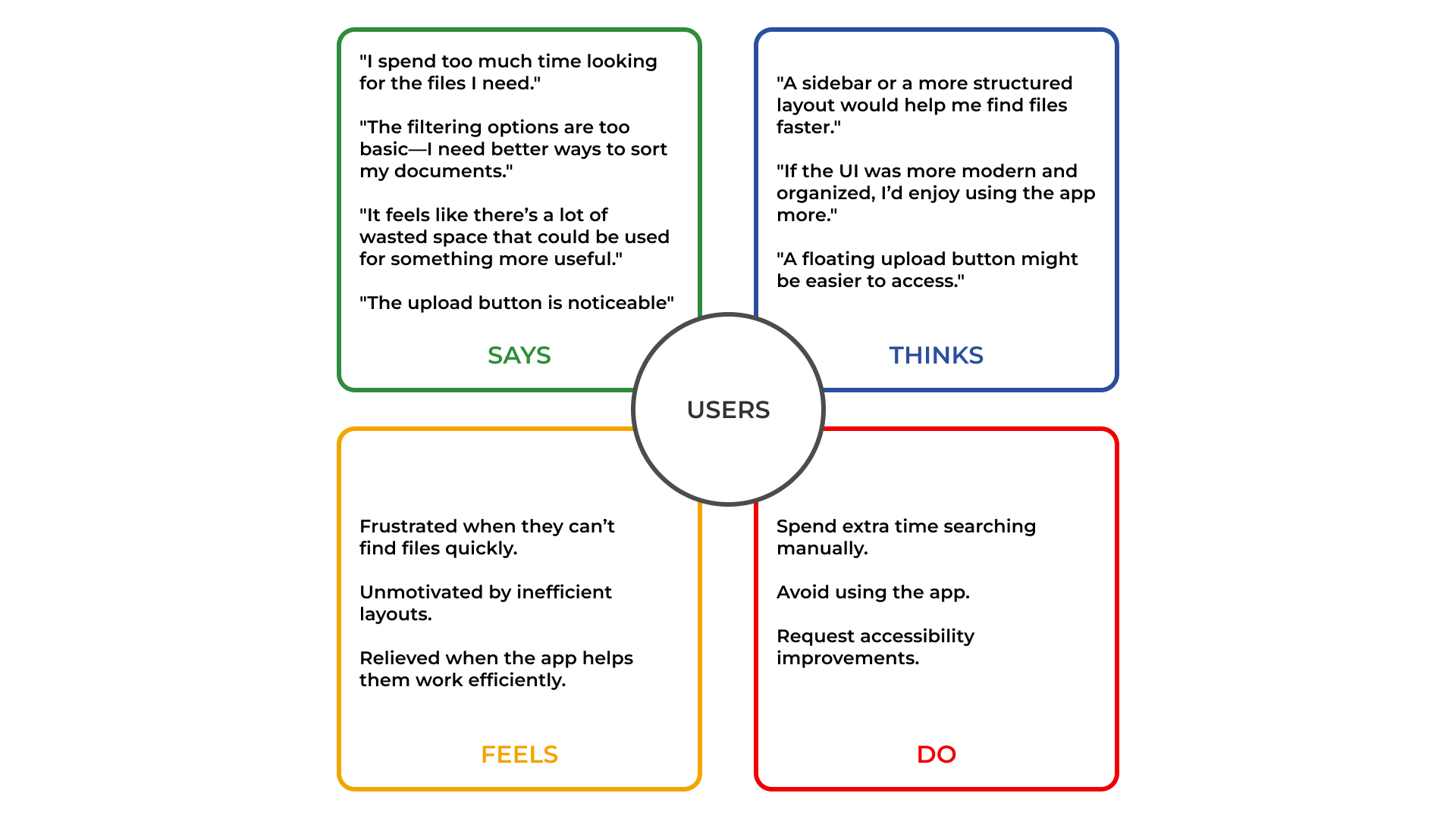
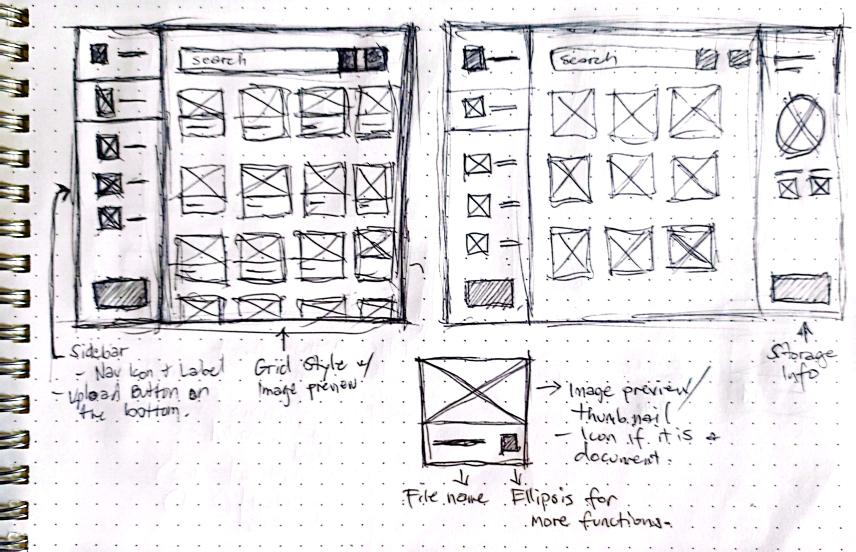
To better grasp what needs to be improved with the old design I conducted a usability test for the old design to gather insights directly from the user.
After conducting usability tests from different user groups (doctors, development team, and stakeholders), we gathered the following insights:
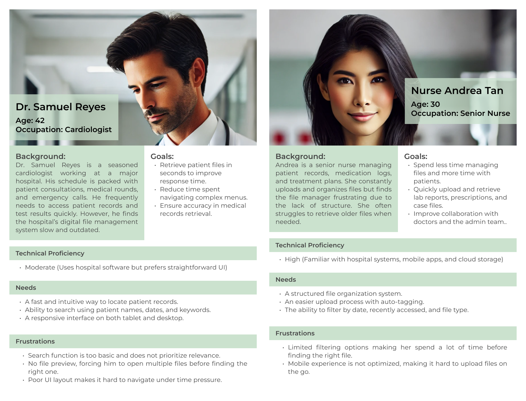
As a busy cardiologist managing multiple patients,
I need a fast and accurate way to search for patient records,
So that I can retrieve critical information quickly and make informed decisions during consultations.
As a doctor under time pressure,
I need a file preview feature,
So that I can verify the correct document without opening multiple files.
As a healthcare professional working across devices,
I need a responsive interface that works seamlessly on both tablets and desktops,
So that I can access files without delays, regardless of the device I’m using.
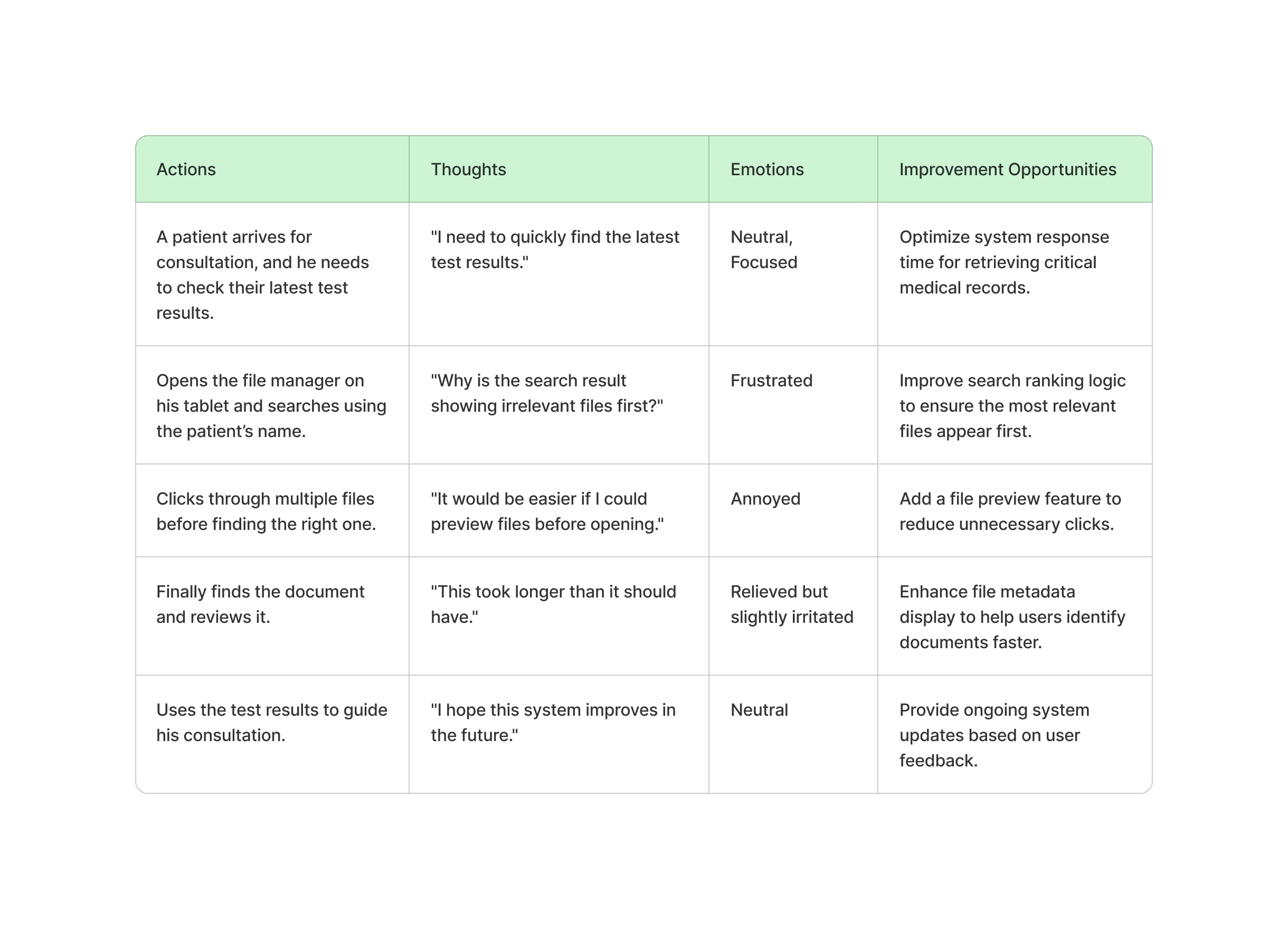
As a senior nurse,
I want to quickly find and retrieve patient records using filters and search,
So that I can provide immediate care without delays.
As a senior nurse,
I want to easily upload and organize patient reports with automatic categorization,
So that files are properly stored and easy to retrieve later.
As a senior nurse,
I want to access and manage files on my mobile device easily,
So that I can retrieve patient data even when away from my desk.
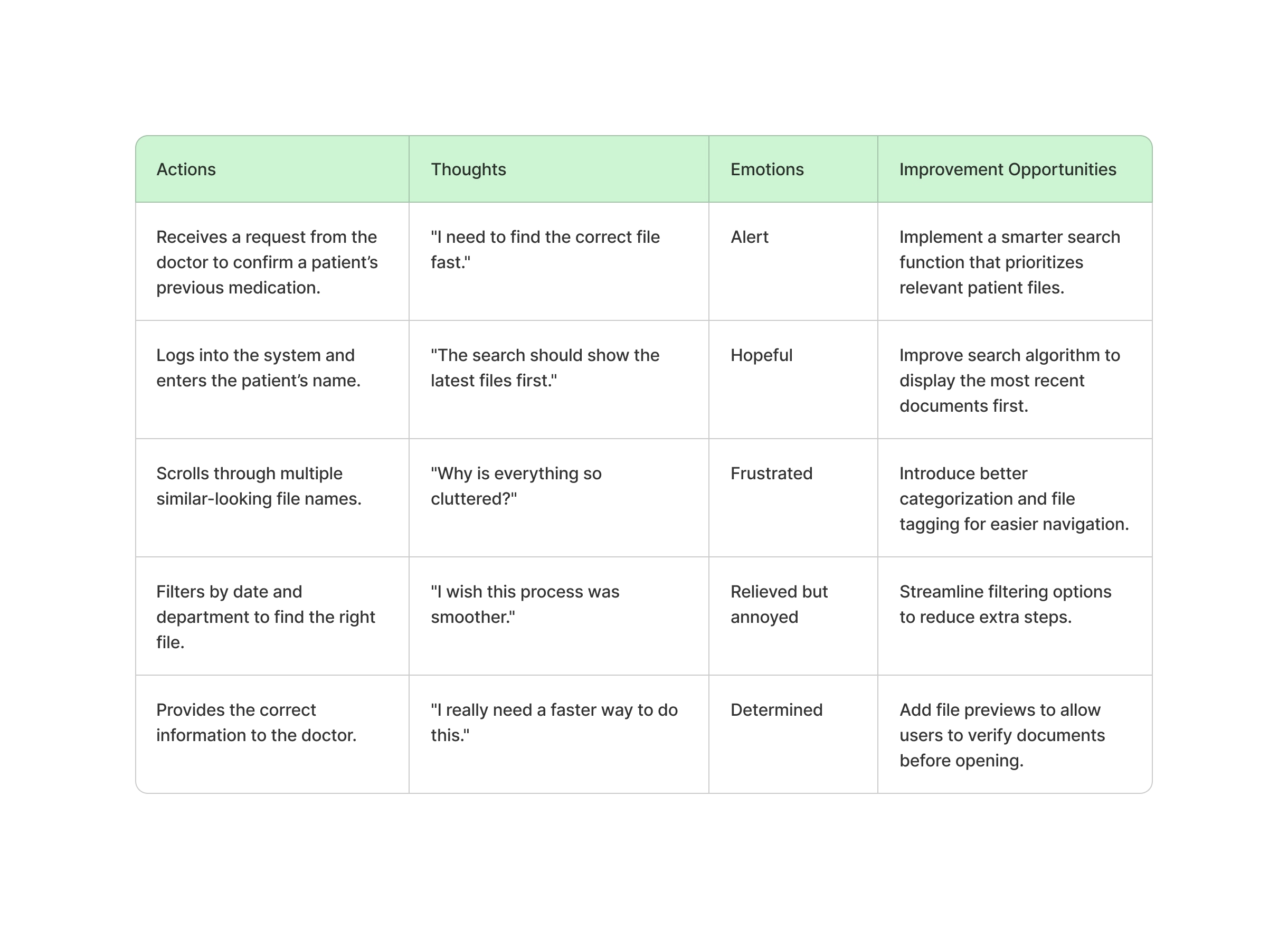
The hospital’s digital file management system is inefficient and outdated, causing delays and frustration for medical staff. Doctors struggle with slow and irrelevant search results, impacting their ability to retrieve critical patient records quickly. Nurses face challenges in organizing and locating files due to the lack of a structured tagging and filtering system.
To improve workflow and patient care, the system needs a faster, more intuitive, and structured file management solution that enables quick search, seamless navigation, and better organization.
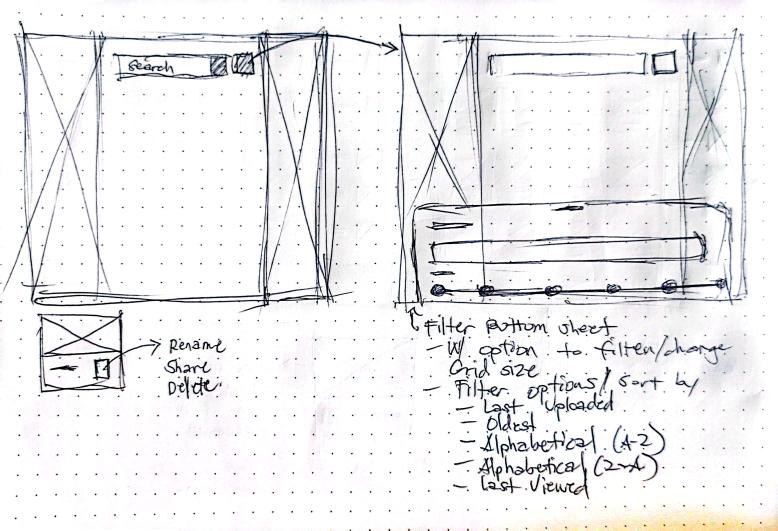
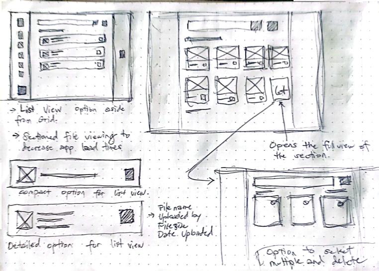
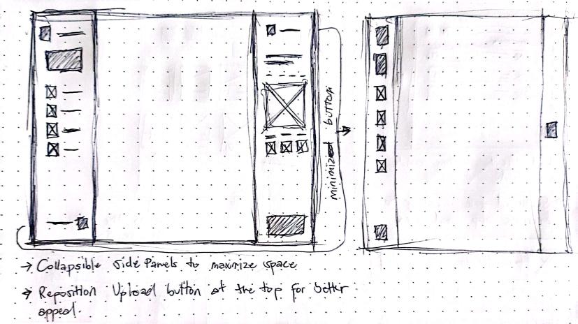
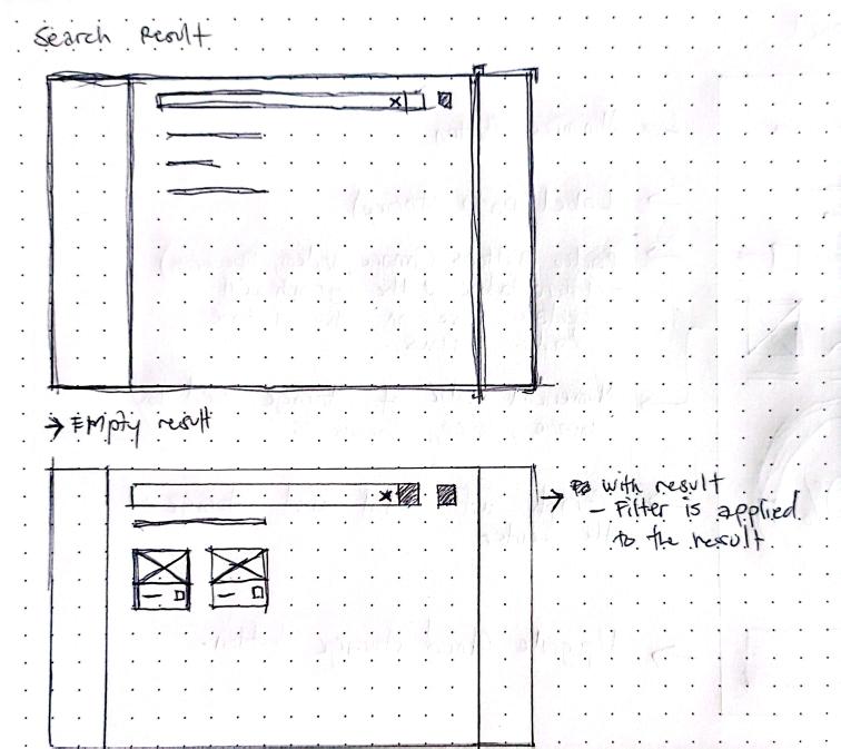
By using insights gain from the user's feedback and research, I began brainstorming different ways to answer my HMW's and improve the system altoghether. Some of the key ideas included:
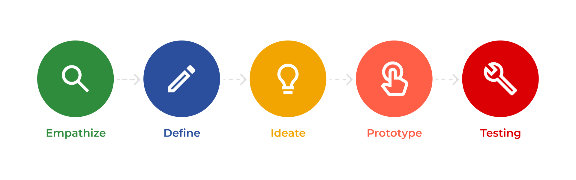
After creating wireframes, I developed low-fidelity prototypes to visualize the user flow and interactions more clearly. I then conducted initial usability testing with key stakeholders, including doctors and nurses, to gather valuable feedback on the system’s navigation, organization, and overall usability. This early testing phase helped identify areas for improvement, ensuring the design aligned with user needs. After receiving positive and constructive feedback, I refined the design and proceeded with high-fidelity prototypes, incorporating visual elements, branding, and interactive components to create a more polished and realistic representation of the final product.

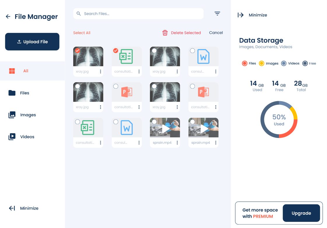
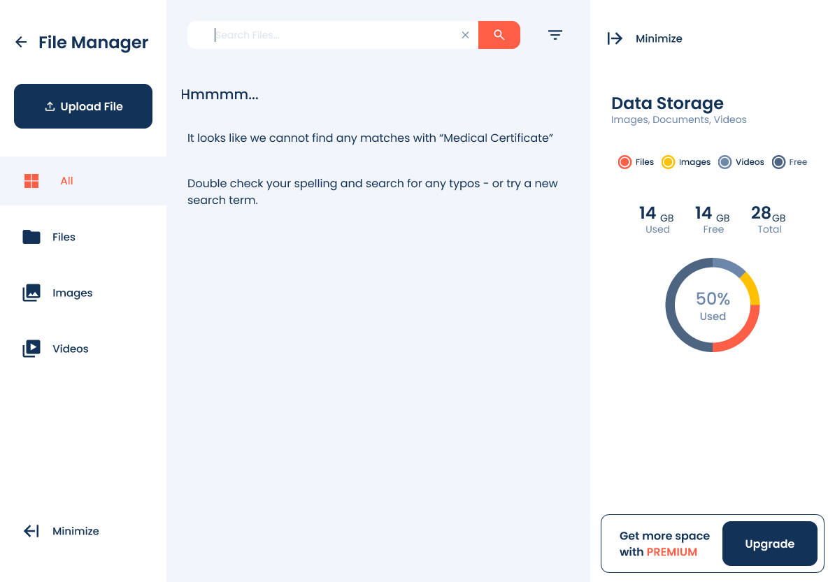
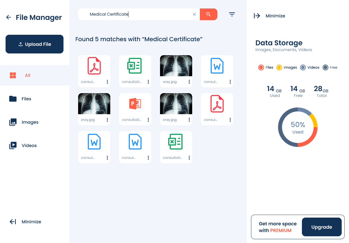

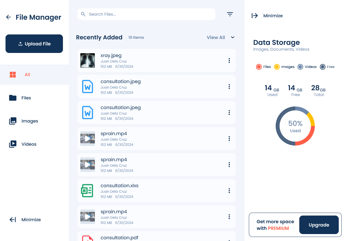
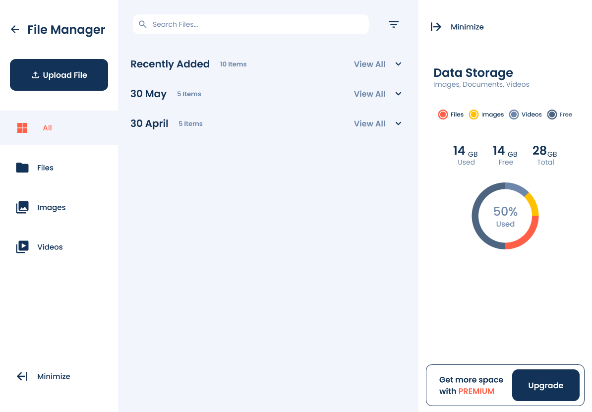
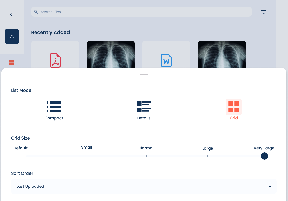
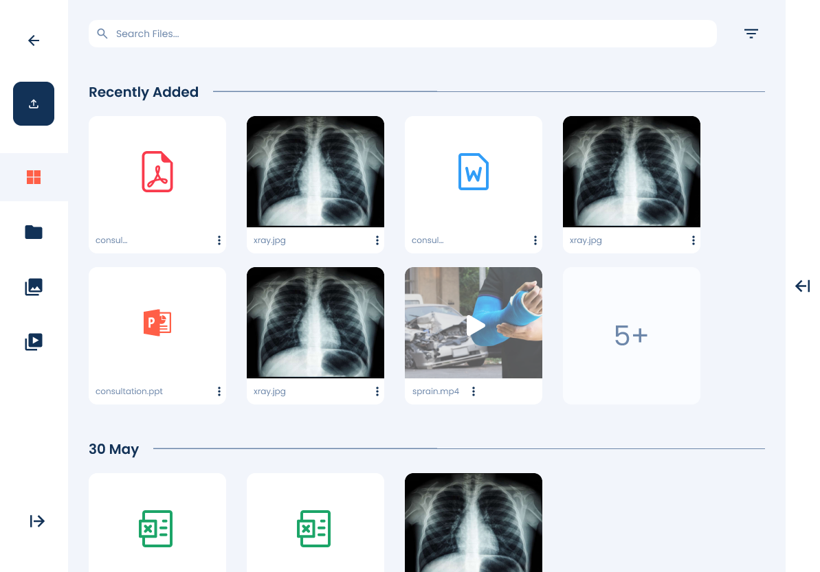
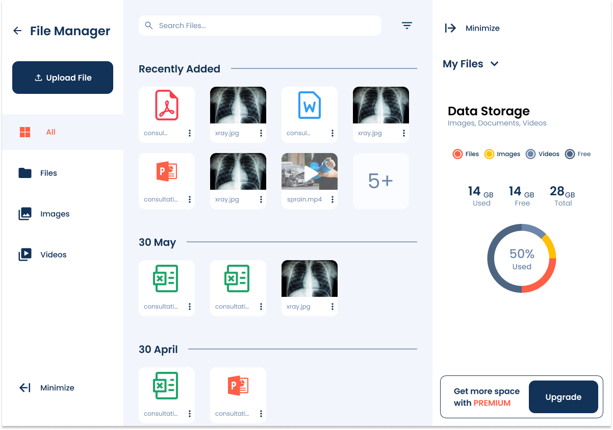
After completing the high-fidelity prototype, I presented it for an in-depth review and usability testing with users. They were able to interact with the refined design, exploring the improved navigation, enhanced search functionality, and structured file organization. The feedback was overwhelmingly positive, confirming that the redesign successfully addressed previous pain points.
With this validation, the prototype was officially endorsed and handed over to the development team for implementation.

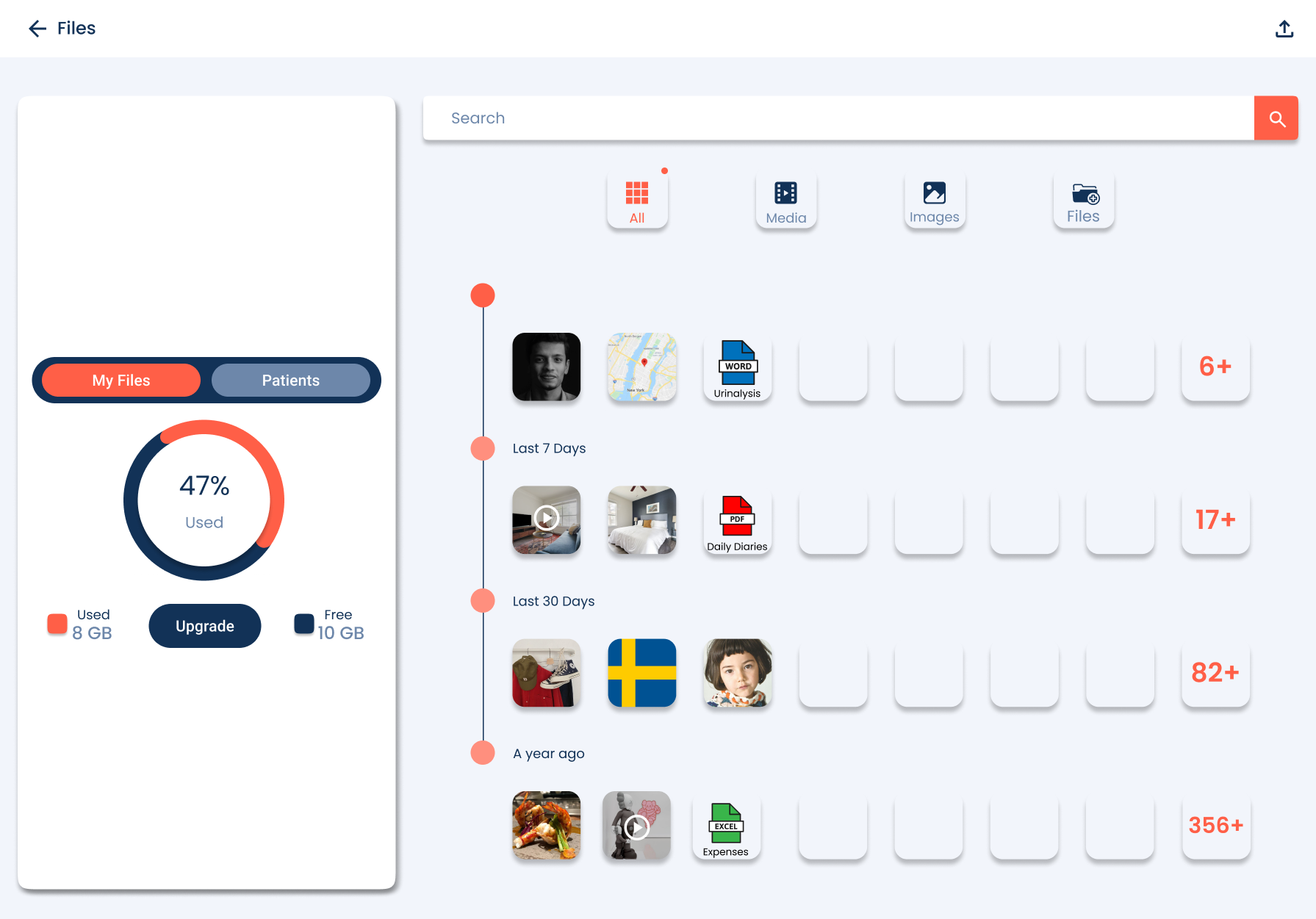
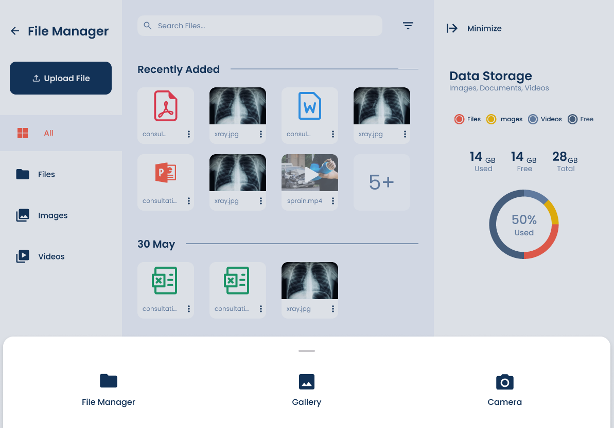
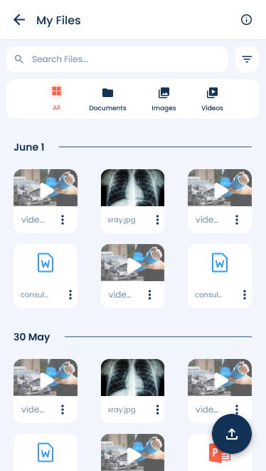
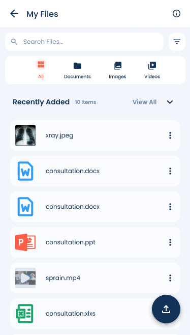
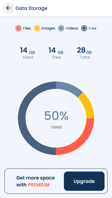
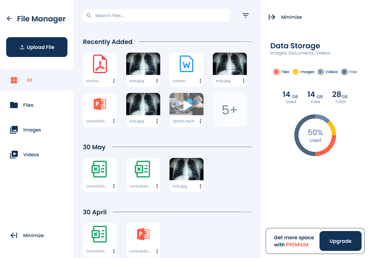
Mobile Version

The redesign of the hospital’s file management system successfully addressed critical usability challenges, improving search efficiency, navigation, and overall workflow for its users. By leveraging user feedback, iterative prototyping, and usability testing, the final design created a more intuitive and structured system that enhances daily operations. The overwhelmingly positive response from users validated the improvements, and the design was officially endorsed for development.
Let's chat?
caironworkmail@gmail.com